(This interview was first published on our sister website, Awards Radar)
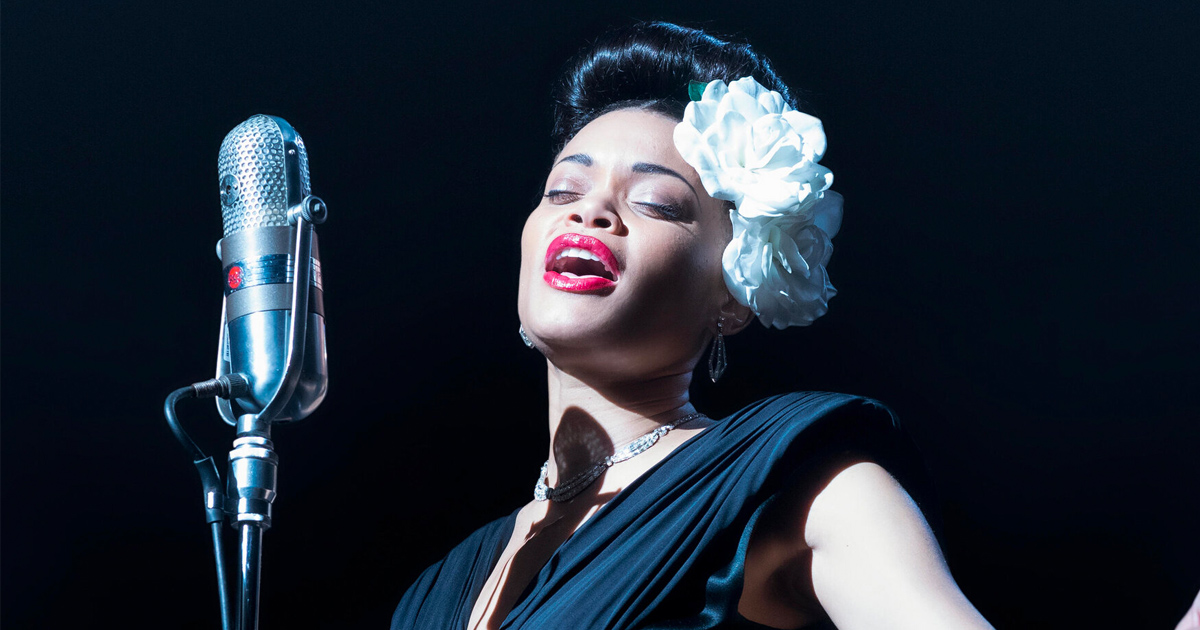
1940s New York. An iconic period of American history characterized both by a freewheeling jazz scene and the specter of addiction and racial violence. How do you translate such a world to the modern screen? And how do you make it feel lived in by someone like famed jazz singer Billie Holiday? I had the chance to speak with production designer Daniel T. Dorrance to find out. Dorrance created the movie’s vintage, high-contrast look he characterizes as “faded opulence.” We chat about director Lee Daniels’ vision, the nuts and bolts of building and designing the venues and dressing rooms featured in the film, and the creative team that collaborated to make it all happen.
The biopic tells the story of Billie Holiday’s (Andra Day) remarkable life marred by addiction and the efforts of the United States government to stop her performing “Strange Fruit,” which has been referred to as the “musical starting gun for the civil rights movement.”
I understand you were involved in this movie a few years back because it didn’t quite get off the ground the first time?
Daniel T. Dorrance (DTD): Yes that’s right, we were going to go to Atlanta at that time. I did my whole extensive research stint at that point. So when we came around this time, my head was around it already, which is fantastic because when we began, we had like ten weeks until we started filming.
A lot of the movie is set in old New York, 1930s, 1940s. When I think about that time, I don’t think about it with the same sharpness or color scheme that I do modern scenes, so it was really cool to see that translated on the screen. What kind of direction did you get from Lee Daniels when you first started out? Did he have a specific vision of New York he wanted you to recreate?
DTD: Initially we said let’s get the period correct. Let’s try to hit that mark. When we first started in my research, I found a great image of New York. It was a black and white photo of Times Square that somebody had put their version – what they believed the color photograph would have been at that time. It just felt so right. The tone was correct, the palette just felt right for what this movie wanted to be. So I got a picture of Andra Day. I gave her a mink stole and an umbrella and put her into this shot. I showed Lee and he was like “Oh my god! That’s it! That’s the tone.” We blew those images up and used it as our inspiration from that point forward. Everyone, from costumes to the Director of Photography, we all used that as the jumping off point.
If I had to put a title on it, “faded opulence” is what I was hoping for on all locations and set builds. Something that was grand at the time but has lost its luster a little bit.
You’ve answered this in part, but how would you describe the palette of the movie?
DTD: Certainly dark tones. We treated all the walls. Andrew Dunn and I pitched to Lee, let’s darken everything maybe 40% more than you normally would. So all the cast and costume break away from the background. They sort of float in the space. As you’re watching, the walls and everything creep back into your subconscious, into your view. That was on purpose. We sat with costumes, we sat with Lee, we did a whole scheme on every set. Anytime we’re in a space, I keyed off what costumes were doing. Or sometimes he would change it to what I was doing if we couldn’t change the wall colors or something. We just all played with that idea.
To put a color tone on it, that’s a tricky one because they’re all so different. For the exteriors, you could call it ebony green, and interiors, you could call it emerald blues. You take the hue way down, you almost take it to a grey-blue at some points, and sometimes you pop the blue. If I had to say there were any two colors that were featured the most, it might be those two.
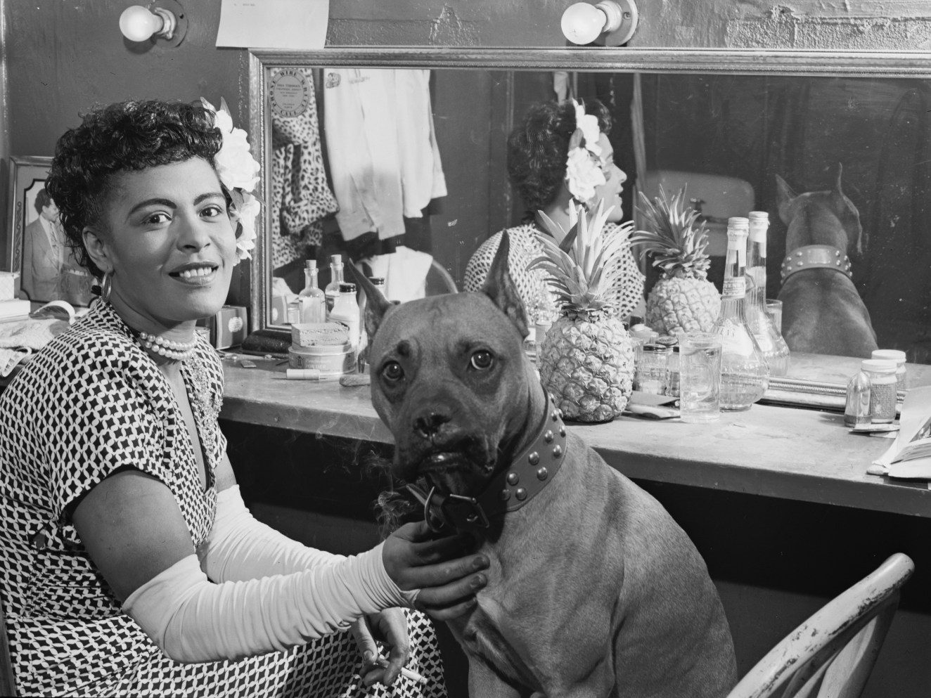
And then for the dressing rooms, we really tried to make each one unique and iconic in its own way. A lot of times we’re playing with the costume color, whatever she was wearing backstage, and then we’d shift off of that, or play into that, and then knock the color way back so it really went dark against the wall. And wallpapers were huge too for us in this movie. The decorator found a vintage wallpaper store in New York that actually sold wallpaper of that period, so 1940s wallpaper. We got the catalog and went through it. We’d get them in and we found out they were so old and so fragile we couldn’t even put them on the wall so we had to scan them ourselves and make our own wallpaper using their designs.

It really shows through – the attention to detail and the way everything pops but also fits with the period. I understand you actually built the whole set for Café Society. You had to recreate it, and there’s not a ton of old photos of it. What were the most important things to you to recreate, and what did you feel you could take more creative liberties with?
DTD: We were trying to find a venue that could be a stand-in for Café Society, and I would bring in elements to tie into that. But in the end I couldn’t find a location that would give us the time frame to make all that happen. It was 2019, pre-COVID, all these concert venues were busy, so we were really lucky to find a place in the calendar during our shoot time. As we looked and looked and looked, we said ok we’re not going to find Café Society because I’ll need to put murals up, I need to really spend some time there, so we decided to build it.
The murals were probably the key element. The layout of the place – people really sat on the floor right around the artists, whoever performed there, people were right amongst them because they brought the singer or player out into the audience. And then we had our own geography we had to live by in terms of the story Lee wanted to tell for where people sat in relation to each other. In reality there were two Café Societies. There was one downtown and there was one uptown. So in talking to Lee, we said it was too confusing to have two, let’s create a hybrid of both. And then we had to find an exterior that worked well, and that all happened in old Montreal. The key thing for me was to get murals as close as we could. And then for the backstage, we had nothing on that or the dressing rooms so that was complete creative license there and what worked well for the scene, the blocking, people sitting or entering.
Yes, the dressing rooms were so alive.
DTD: The set decorating in all those places was really layered and we tried to show some history with all of them. We tried to make it Billie’s. A lot of flowers. Lee wanted a lot of layers of flowers. And little personal touches, little photographs of her with her dog in the mirror. I think we found in the research she had a pineapple in her dressing room. *chuckles* Not sure why.
Later on in the movie there’s this long sequence through a cabin, arguably the climactic moment of the film. Was this done as one continuous shot? And tell me about the challenges you faced prepping for and then shooting that scene.
DTD: Yes, it was one continuous shot, a “one-er” as they call it. The script didn’t have that layout in it. It was described as “she gets off the bus and finds someone has been hung in a tree.” We found this great tree, and a cabin next to it. In one location there was a burnt out house next to a tree, so I purchased the burnt out cabin and brought it over. That’s what’s behind the burning cross, as if they burnt their house down. At that point, Lee started thinking “what if she, after seeing the hanging body, she runs off into the cabin” and we started riffing off of that. As she goes through the cabin, it’s like a maze.
The cabin itself didn’t have any interior walls, so we had free reign on what we hoped to pull off in there. We had to make it feel bigger than it was, so we put a series of hallways, small rooms. It’s a poor cabin, ultimately, with newspaper for wallpaper and things like that. Then we set out to do the geography for the Steadicam shot. The operator is always leading Billie through the space so he’s walking backwards. She enters the cabin, we have need space for him and Billie, so sometimes we pull walls out. He can walk through, she can walk through, and then put the wall back in, so it’s this magic space that people come out of nowhere in.
The choreography was difficult, that was probably the hardest part of it, figuring out how we do that in about seven minutes. We shot film and there’s only about seven minutes on a mag reel so you run out of film if you don’t get it. Ultimately she ends up on stage.
That is really impressive to hear about.
DTD: On the day we shot that, oh man. We’re watching on a monitor in a secondary space and you can hear the little girls crying and the father crying – I get goosebumps talking about it right now. As we’re watching it on the monitor, you’re hearing the live sound of this moment. I swear everyone on the monitor was tearing up because it was so powerful as Billie’s going through her freak out. It’s not a happy subject to be a part of, but it’s the key shot of the movie. That’s what drove her to want to get that message out.

Yeah, it tells its own story within the whole biography. My next question may not quite be your domain but I was curious about it. In a lot of period pieces there’s a lot of smoke indoors because of course everyone smoked back then. Is that all created using fake cigarettes, or is there a balance you have to strike so there’s not too much?
DTD: It’s very precise. Cigarette smoke does add to it, but we enhance that with effects smoke. Sometimes we have to let it settle a little because there’s too much. It’s really done to enhance atmosphere and to allow the lights to do their job because smoke catches light, and sometimes you want that little halo effect around someone’s head.
In a lot of locations, you have smoke alarm issues, so we have to hide all the smoke alarms and tape them up and all these things, and they get the fire department involved *chuckles*. It’s a simple thing you’d think but there are all these other factors. All those things are well-thought-out and controlled.
What were some of the most interesting tidbits about Billie Holiday’s life or habits during research for this film?
DTD: I guess ultimately her scale of living. Obviously I knew Billie Holiday, I knew her music and I’ve always been a fan of it, but even what we cover in the movie, in terms of the war on drugs starting with her, I did not know any of that. That’s what I love about any film I work on is what you learn about each subject. Her history was what I ultimately learned about her. Her personal history as opposed to her public life history. Where she lived, what kind of house she may have lived in.
And that’s another thing. In the movie, Lee wanted to show, from the black perspective, that not everyone lived in squalor. [Billie] lived in a beautiful house but had these habits, and all the people that were in her life didn’t live in a slum. We tried to elevate everyone – where they lived, how they lived, what kind of car they drove, etc. Her two sidekicks for instance, one of them lived in a brownstone. It’s funny, that brownstone shot was probably one of our only real New York exteriors because we had a hard time finding that look in Montreal.
That’s super interesting to me. I know most of the film was shot in Montreal but I was thinking “Dang that looks a lot like that could be in Brooklyn or Midtown or something.”
DTD: To double back to where we started, that shot of [Billie] walking through downtown New York with the rain and lights in the background. That wasn’t in the script. When I showed Lee the image I initially photoshopped, he was so blown away by it he was like “We gotta get this in the movie.”
It is very iconic. And for the continuous shot earlier in the movie, when you saw it the first time, what did you think?
DTD: I look at how the blend is working, how all the pieces that we built on the day, if they make sense. I’m looking at more of that practicality part as opposed to the storytelling. I’m thinking about the walls, how I wish I put a little more color on that wall. *chuckles*
Like Lee, I don’t know exactly what we’re shooting until we walk into the set. So he’ll walk in in the morning and bring the cast in and say “Okay, everyone out.” And he sits there with the cast for a half hour and they block the scene and he makes everyone feel comfortable about what they’re doing, and only then do we truly know what’s on camera.
It’s really interesting to hear it from that perspective because you’re going to be thinking of those other things that aren’t at face value, what the audience is getting.
DTD: And you’re excited to see the final product because it’s like “Did all our conversations actually work in the end you know?” *chuckles* Were those good decisions? I think about the creative team on this movie, we really had a great collaboration on this. We had a lot of fun breaking all the stuff down and pulling it together and making it work.
Interview has been edited for clarity and brevity.
The United States vs. Billie Holiday is streaming now on Hulu.